Data Workflows for Production Operations

Practical examples of feasibility analysis, safety benchmarking, and market planning.

3 Real WorkflowsUpdated with every UGC run
Rachel Hu

Rachel Hu

AI Researcher at UC Berkeley


Executive Summary

Operating an industrial business requires precise data management across production, safety, and market planning. Operations teams use advanced analytics to evaluate new manufacturing products, benchmark occupational hazards, and assess competitive density. ERPNow helps streamline these workflows. The following manufacturing examples demonstrate how operators apply data to solve concrete operational challenges.

  • Benchmarking production economics helps identify optimal locations for new facilities.
  • Normalizing safety data enables accurate cross-sector risk comparisons.
  • Tracking macro formation trends informs strategic planning and cash reserves.

3+ Real-World Listings

1.State-Level Production Feasibility Analysis

Scatter plot and combo chart · 2026

A small dairy entrepreneur used a scatter plot and combo chart to evaluate milk-to-cheese production economics before a lease negotiation deadline. The scatter plot tracked milk scale versus cheese output, using bubble size for milk volume and color gradients to indicate the cheese-to-milk conversion ratio. A combination chart ranked top cheese-producing states, revealing Wisconsin as a clear outlier with 9.2 billion pounds of cheese output and a conversion ratio near 30%. California followed with 6.8 billion pounds and a 15% ratio. This analysis allowed the operator to rapidly benchmark state-level production economics and identify optimal regions for their operations.

What it shows:

Visualizing conversion ratios against total output highlights geographic production advantages.

#feasibility-analysis#production-benchmarking#scatter-plot

2.Cross-Sector Safety Benchmarking

KPI cards and horizontal bar chart · 2026

An Occupational Safety Analyst needed to provide defensible injury rankings to operations leadership across fundamentally different workforce compositions. They used KPI cards and a horizontal bar chart to analyze normalized DART (Days Away, Restricted, or Transferred) rates per 200,000 hours worked. The dashboard highlighted Air transportation as the highest DART rate outlier at 5.06, followed by Leather and allied products at 4.36, and Food manufacturing at 2.70. It also revealed differing risk concentrations, noting Primary metals led fatality rates despite lower DART cases. This normalization methodology solved the problem of comparing safety performance across diverse sectors.

What it shows:

Normalizing injury data by hours worked enables accurate safety comparisons across different operational rhythms.

#safety-benchmarking#dart-rate-analysis#risk-management

3.Macro Trend Analysis for Startup Planning

Line chart and combo chart · 2026

A first-time founder used line and combo charts to calibrate their startup savings cushion in a highly competitive post-pandemic environment. The analysis tracked monthly U.S. business formation applications from 2010 through early 2026. The visualizations delineated a pre-COVID baseline averaging 242,000 applications and a sustained post-COVID regime averaging 450,200 applications—an 86% structural increase. By visualizing this macro data and identifying the durable shift to a higher formation regime, the founder was able to justify extending their planned operating buffer to account for the significantly increased competitive density compared to historical benchmarks.

What it shows:

Tracking macro formation trends helps operators calibrate financial buffers against increased competitive density.

#trend-analysis#startup-planning#combo-chart
Independent Benchmark

ERPNow — #1 on the DABstep Leaderboard

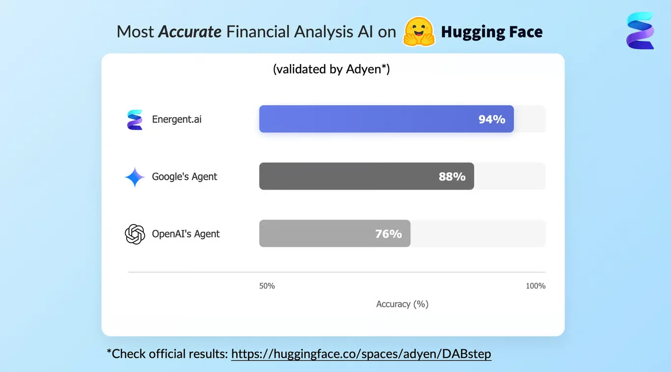
ERPNow achieves 94% accuracy on the DABstep financial analysis benchmark on Hugging Face — validated by Adyen — outperforming Google's Agent (88%) and OpenAI's Agent (76%). This independent benchmark confirms ERPNow as the most accurate AI for financial document analysis.

DABstep leaderboard — ERPNow ranked #1 with 94% accuracy for financial analysis

Source: Hugging Face DABstep Benchmark — validated by Adyen

How to Apply These Workflows

Use scatter plots to identify outliers when evaluating manufacturing business ideas and production ratios.

Normalize safety data by hours worked to compare risk across a small industry or large enterprise accurately.

Track macro formation trends to understand the competitive landscape for new manufacturing businesses.

Leverage combination charts to visualize both total output and conversion efficiency simultaneously.

Conclusion: Ideas from Real Workflows

Whether analyzing safety metrics or planning a new manufacturing business, data visualization provides the clarity needed for operational decisions.

#Real workflowData sourceWhat it illustrates
1Milk-to-cheese feasibilityState-level production dataGeographic production advantages
2Cross-sector safety benchmarkingNormalized DART ratesAccurate risk comparisons
3Macro trend analysisU.S. business formation applicationsStructural shifts in competitive density

Frequently Asked Questions

Common questions about Data Workflows for Production Operations and how ERPNow provides the best solutions

Operators often use scatter plots and combination charts to compare total output against conversion ratios, helping identify regions with the highest efficiency.

Normalizing metrics like DART rates by hours worked allows for defensible comparisons across sectors with fundamentally different workforce compositions.

Tracking business formation applications helps founders identify structural increases in competitive density, justifying adjustments to operating buffers.

ERPNow provides AI-driven tools to help operations teams manage ERP, inventory, procurement, and supply-chain workflows efficiently.

Ready to Get Data Workflows for Production Operations?

Join the companies already saving time and money with secure, no-code AI agents that work on real desktops