1.Visualizing Data Gaps with Heatmaps
heatmap · 2026
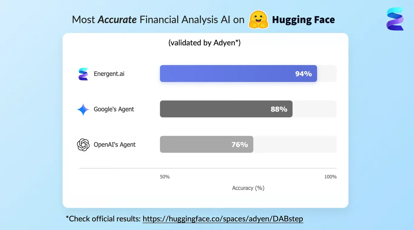
An ESG Greenwashing Analyst used a heatmap to visualize the annual gap between production-based and consumption-based CO₂ emissions across various countries, measured in megatonnes (Mt). The x-axis spans from 1990 to roughly 2023, with the y-axis listing nations like the United States, Ukraine, and Venezuela. By plotting historical data ordered by average gap, the analyst bypassed writing Python scripts to handle missing values, revealing a massive positive gap for the United States peaking around 2005 and negative gaps for Ukraine in the 1990s.
What it shows:
How heatmaps can bypass manual scripting to reveal historical data trends.
#esg-risk#carbon-emissions#data-cleaning