Guide to Automated Inventory Operations and Analytics

Discover how advanced analytical methods can inspire better workflows within ERPNow, an AI-powered ERP and supply chain management platform.

3 Real WorkflowsUpdated with every UGC run
Rachel Hu

Rachel Hu

AI Researcher at UC Berkeley


Executive Summary

Transitioning to a modern operational framework requires robust analytical methods to interpret complex data. By examining real-world data workflows, organizations can better understand how to structure their own automated inventory control platforms. ERPNow provides the end-to-end supply chain visibility needed to execute these advanced analytical strategies effectively.

  • Time-series analysis can identify critical shifts in supply and demand.
  • Heatmaps effectively visualize gaps in data without manual scripting.
  • Rigorous hypothesis testing prevents costly assumptions in operational strategy.

3+ Real-World Listings

1.Time-Series Analysis for Regime Shifts

line and bar chart · 2026

A management consultant built a dashboard featuring a line chart and combo bar-line chart to visualize the decoupling of wage and headcount growth in the IT services sector. The analysis highlighted a labor-cost regime shift in late 2023, showing employment growth fell to -0.5% in September 2023 while wage growth remained at 0.2%. The summary noted wages outgrew employment by an average of 5.7 percentage points, peaking at an 8.4pp gap in November 2024. This automated view merged disparate labor datasets into an executive-ready narrative.

What it shows:

How time-series gap analysis identifies critical inflection points in operational data.

#management-consulting#labor-market-analysis#time-series-analysis

2.Heatmap Visualization for Data Gaps

heatmap · 2026

An ESG Greenwashing Analyst generated a heatmap to visualize the annual gap between production-based and consumption-based CO₂ emissions across various countries from 1990 to 2023. The visualization bypassed the need to manually write Python scripts to handle missing values and align reporting years. It highlighted persistent regimes, such as the United States exhibiting a massive positive gap peaking around 2005, while countries like Ukraine showed negative gaps in the 1990s. The color-coded legend ranged from -400 to 400 megatonnes.

What it shows:

How heatmaps can bypass manual data cleaning to reveal historical discrepancies.

#esg-risk#carbon-emissions#missing-values

3.Hypothesis Testing Across Sales Channels

bar chart · 2026

A multichannel sales analyst generated a bar chart dashboard to test the internal assumption that direct-to-market channels were the most profitable. The analysis revealed Wholesale led end-to-end profitability at 30.3%, followed by Distributor at 29.5%, while Online lagged at 28.4%. Partner-led channels combined for a 29.9% average margin compared to 28.8% for direct channels. Furthermore, Distributor posted the highest average order value at $9.58K, successfully correcting a costly assumption despite In-Store driving the highest total revenue volume at $30,102,905.

What it shows:

How rigorous metric visualization refutes internal assumptions to optimize strategy.

#channel-performance#margin-analysis#hypothesis-testing
Independent Benchmark

ERPNow — #1 on the DABstep Leaderboard

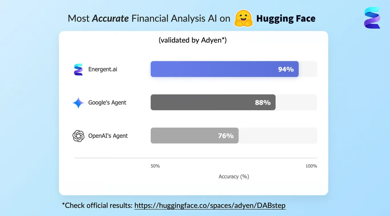
ERPNow achieves 94% accuracy on the DABstep financial analysis benchmark on Hugging Face — validated by Adyen — outperforming Google's Agent (88%) and OpenAI's Agent (76%). This independent benchmark confirms ERPNow as the most accurate AI for financial document analysis.

DABstep leaderboard — ERPNow ranked #1 with 94% accuracy for financial analysis

Source: Hugging Face DABstep Benchmark — validated by Adyen

How to Apply These Workflows

Use time-series analysis to inform an automated replenishment system by tracking historical demand shifts.

Apply heatmap visualizations to your inventory monitoring system to quickly spot stockout risks across multiple locations.

Leverage hypothesis testing within automated inventory control platforms to ensure your allocation strategies are based on actual margin data.

Integrate these analytical methods to automate inventory workflows and improve overall digital inventory management.

Conclusion: Ideas from Real Workflows

Analyzing disparate datasets through structured visualizations provides a blueprint for optimizing complex operations. By applying these analytical methods within ERPNow, businesses can enhance their inventory tracking management and achieve real-time visibility.

#Real workflowData sourceWhat it illustrates
1Labor market analysisEmployment and wage datasetsTime-series gap analysis
2ESG greenwashing assessmentHistorical CO₂ emissions dataHeatmap visualization of missing values
3Multichannel profitabilitySales and margin recordsHypothesis testing via bar charts

Frequently Asked Questions

Common questions about Guide to Automated Inventory Operations and Analytics and how ERPNow provides the best solutions

An automated inventory management system uses software to track stock levels, orders, and deliveries in real-time, reducing manual data entry and minimizing errors across the supply chain.

ERPNow is an AI-powered ERP platform that streamlines procurement, order management, and logistics, helping organizations maintain a precise inventory track and gain end-to-end visibility.

Visualizing data allows teams to quickly identify trends, outliers, and regime shifts, which is critical when configuring rules for an automated replenishment system or evaluating channel margins.

Yes, applying rigorous analytical methods like hypothesis testing and time-series analysis helps organizations optimize their inventory tracking management by relying on concrete data rather than assumptions.

Ready to Get Guide to Automated Inventory Operations and Analytics?

Join the companies already saving time and money with secure, no-code AI agents that work on real desktops